“I’m interested in using PowerPoint for my incoming presentation. Is there anything I should know before I start?” Yes, there is! You should consider the most common PowerPoint presentation mistakes most presenters make when sharing essential information with colleagues, clients, students, and beyond.
When presenting any type of information using PowerPoint, you must ensure your presentation isn’t confusing or hard to digest. Focus on conveying your message in an inspiring, motivating, and informative way.
How? By avoiding the common presentation mistakes. Today, we’ll discuss the top 11 common PowerPoint mistakes you should avoid and give you the best prevention tips to help you stay on course and make your content stand out.
In this article
The Cost of Presentation Mistakes
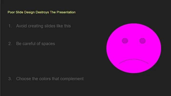
Presentation mistakes can be a real dealbreaker for your target audience. They can make a presenter look unprofessional and unconvincing, resulting in a bad reputation and brand image. Though mistakes happen no matter what you do, you can avoid the most common ones to ensure your audience that you know what you’re doing.
Otherwise, you could look like a total beginner. Since your reputation, career, and well-being may be on the line here, let’s delve deeper into the consequences of delivering a poor PowerPoint presentation so you know what’s at stake:
- You’ll miss an opportunity to win a game-changing deal;
- An ineffective presentation could result in losing potential income;
- Poor presentations can have a negative impact on your business;
- Poor quality presentations can increase the costs of your organization due to missing out on business opportunities;
- A bad presentation could cause you to lose potential prospects;
- Unconvincing presentations might cause your audience to turn to your competitors;
- You can’t grow your business, close more deals, and make more sales if your presentations aren’t convincing and engaging enough to motivate your audience to take action;
- Your ideas won’t come to life if you can’t communicate them effectively through informative and engaging presentations.
As you can see, spending time, effort, and resources on an excellent presentation can pay off long-term. It can reduce costs, help you win more deals, and ensure your target audience understands your message.
Most Common Presentation Mistakes
Let’s discuss the top 11 common PowerPoint mistakes presenters make and how they impact your efforts to accomplish a specific goal.
-
Too much text
Putting too many paragraphs and sentences on a single slide won’t help your audience get your point. In addition, you won’t have enough room to explain your point with charts, images, and other visuals.
Text-heavy presentations might feel overwhelming for your viewers. Instead of listening to you, they’ll focus on reading the slides, causing you to lose your pitch.
-
Your font is difficult to read
Though PowerPoint offers various font options, from cursive to print, some fonts are difficult to read. Throwing such fonts on your crowd could result in a misunderstanding of your message or not understanding it at all.
-
Too many images cause distraction
Images can illustrate the point you’re typing to make. They can help make your presentation more exciting and engaging. However, using too many visuals besides your talking points may distract your audience, especially if we’re talking about low-quality images.
Aside from creating a distraction, poor visuals can make your presentation feel cluttered and hard to understand.
-
Poor color contrast
The colors you use to deliver your message may make or break your presentation. They affect the overall contrast. The visuals, such as text boxes, text color, and slide backgrounds, must work together to help you explain your point and convey the message you wish your audience to receive.
Using too many similar color combinations can make your slides hard to read and visually unappealing.
-
Excessive use of transitions
Though transitions make your presentation more interesting by making text shapes and boxes appear at the right time and place, they can distract your audience. Too many transitions per slide keep your audience from focusing on your presentation’s content.
-
Misaligned presentation elements
If your presentation includes too many misaligned and random presentation elements, your audience will respond negatively to all that chaos, causing you to lose their interest. Misaligned objects and wrong spacing can make your presentation look unprofessional and disorganized.
-
Overcrowded slides
Though you should convey your idea with each slide, overcrowding your presentation with too much content won’t help your audience relate to your message or what you’re saying.
-
Inconsistency across slides
Inconsistent content across your slides can hurt your efforts to connect with your audience and ensure they understand your message. Out-of-place headings, inconsistent margins, wrong colors, bold text, and other displaced elements will only cause your viewers to lose interest and stop listening to you.
-
Too many bullet points
PowerPoint presentations with heavy bullet points will look amateur, daunting, and uninspiring in the eyes of your audience. Though bulleting can help convey key takeaways, going heavy on your bullet points will make your slides less presentable and hard to digest.
-
Using distracting background
Your slides’ backgrounds should be simple and related to your content. Otherwise, cluttered background patterns and images will decrease the slide’s transparency, making the text hard to read. If your audience can’t connect the visuals with what you’re saying, they’ll hardly relate to your message or take the desired action.
Even though your presentation includes slides full of data and text, your viewers may find it difficult to follow all that information and catch all the key points. You must guide your viewers through your presentation to save time, effort, and resources, as no one will understand or think critically about the conveyed information.
How to Prevent Presentation Mistakes

Below are the top tips to help you avoid and prevent the most common PowerPoint presentation mistakes to make sure your audience understands the knowledge you wish to convey:
- Use PowerPoint templates and guidelines to guide your audience through your content and prevent information from being cut off the screen;
- Ensure all elements in your presentation are in full alignment to make your slides look professional, concise, and easy to read;
- Improve the overall impact and consistency of your presentation using a color pallet that goes along with your graphic charter;
- Avoid including too many bullet points to make your slides more memorable, scannable, and readable;
- Use different text levels and icons to help your audience relate to your content through multiple focus points;
- Avoid overfilling a slide with too many charts, images, and text, as it will make your presentation feel cluttered and even overwhelming to your viewers;
- Use a large font where possible and replace long sentences with short phrases and impactful keywords;
- Separate the bodies of text with clear and short headings;
- Avoid adding more than six lines of text per presentation slide;
- Ensure your presentations are error-free by double-checking everything;
- Eliminate all double spaces and unused placeholders from your slides to ensure consistency and quality throughout your presentation;
- If you copy/paste slides between multiple presentations, watch out for the formatting errors;
- Use consistent formatting for text spacing, text formatting, and bullet points to boost the credibility and impact of your presentation;
- Optimize your slide formatting using the pre-set PowerPoint layouts.
Bonus: How to Create Video Presentations With Ease
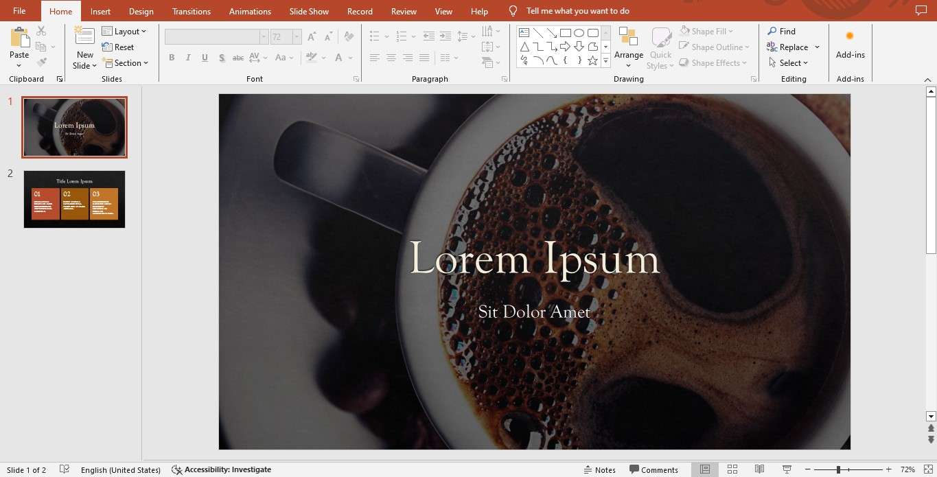
If you don’t want to bother with PowerPoint slides, you can opt for an easier way to create video presentations that have more impact on your viewers. Though PowerPoint can help you increase engagement by including videos in your PPT files, the rather complicated process of adding presenter videos in PP can be a dealbreaker for less tech-savvy users.
If that’s the case with you, we recommend opting for an all-encompassing AI-powered presenter video generation tool like Wondershare Virbo. Virbo uses the power of AI to streamline PowerPoint video production and turn your slides into a comprehensive, easily scannable, and increasingly engaging video presentation.
In addition to turning PPT files into immensely relatable videos, Virbo gives you access to AI avatar models with hundreds of multilingual AI voices. You can rely on Virbo to generate presentation scripts, take AI talking photos, use lipsync effects, add natural-looking avatars to your presenter videos, add translations in dozens of languages, and more.
Here’s how to use Virbo to simplify the process of creating a video presentation from your PowerPoint files.
Step 1: Download and install the Virbo desktop app on your computer;
Step 2: Launch Virbo and sign up for an account;

Step 3: Log in to your account and click ;

Step 4: Import your PPT file and click ;

Step 5: Create a personalized AI avatar for your video presentation or select an AI presenter;

Step 6: Click Text Script to add text or Audio Upload to add a voiceover or narration to your video presentation;
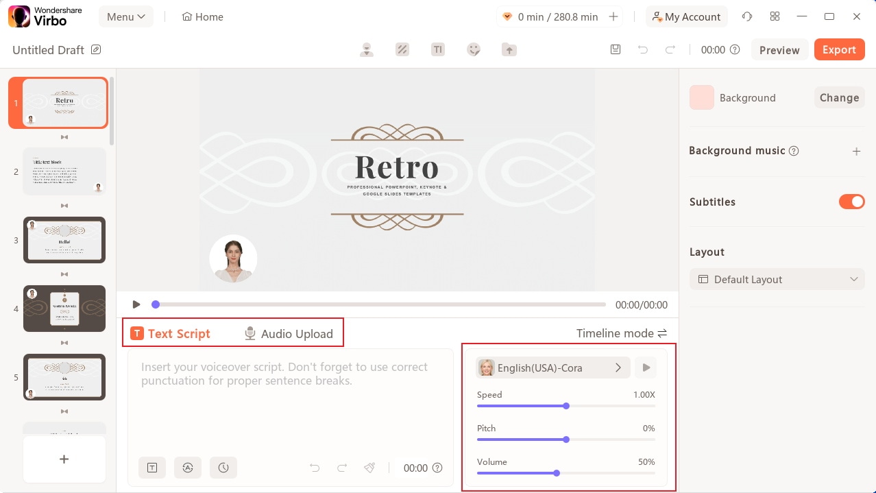
Step 7: Select a background for your presentation, add music, generate subtitles (if needed), and make other necessary edits;
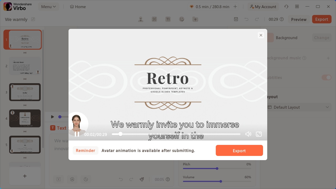
Step 8: Preview your video before exporting and click Export to save your presentation.
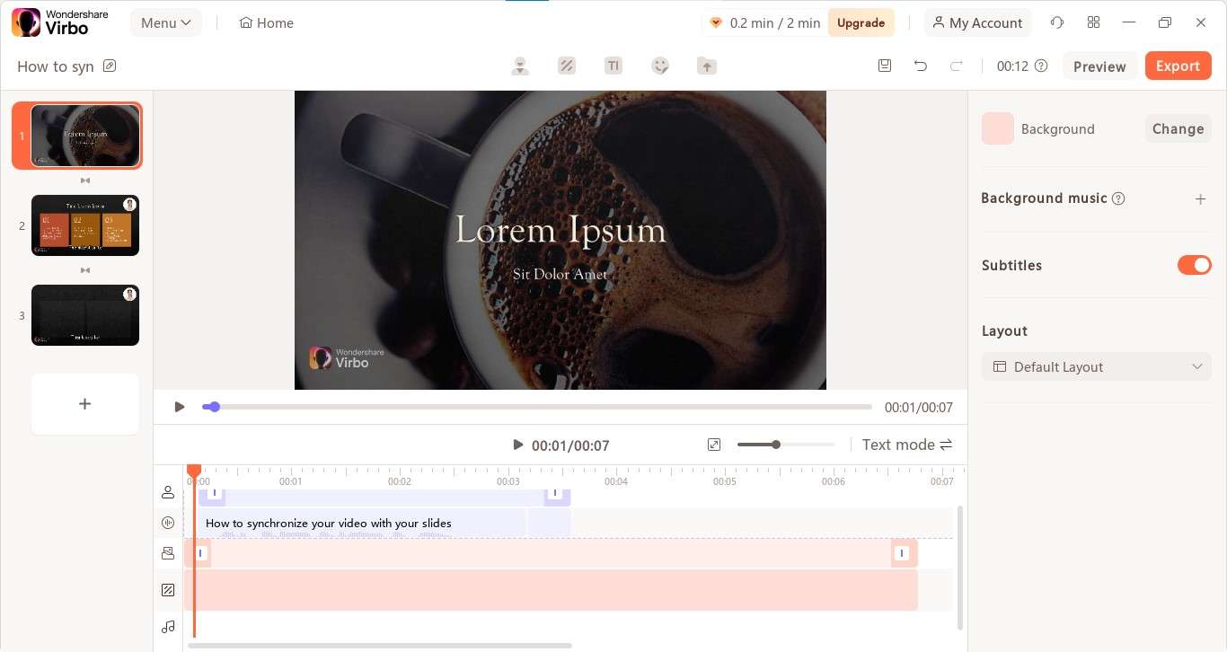
If your video falls out of sync with your slides, you can synchronize it in Virbo by following the steps below:
Step 1: Click the Timeline Mode;
Step 2: Drag your presentation script to the timeline to adjust it;
Step 3: Click Preview to go over your adjustments.
Conclusion
PowerPoint presentations give you an effective, easy, and convenient way to connect with your target audience, express your ideas, and communicate your message. They help ensure your audience relates to your content and resonates with your messaging.
However, they can also be stressful, challenging, and quite tedious, especially if you’re working with this type of content for the first time. Making mistakes is completely normal, but repeating them is what can break your efforts.
This article outlined the most common PowerPoint presentation mistakes presenters make when communicating with their viewers. We also shared general tips to help you avoid and prevent these mistakes so you can deliver an interesting, informative, and engaging presentation.
In addition, we also mentioned Wondershare Virbo AI video generator as an alternative solution for creating video presentations in a more streamlined and easier manner. With Virbo, you can find the best workaround for creating top-grade video presentations to avoid using PowerPoint altogether.


